Lab 2 - 1
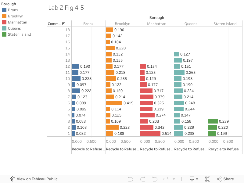
Lab 2 Fig 4-5
This is a bar chart that is used to visualize the ratio of recycle to refuse based on community districts for each of the boroughs of New York, New York. USA. We utlized data provided to us by our Tableau textbook- Ryan Facks zID 2027325
Lab 2 Fig 4-12
This is a bar chart that visualizes the rank of the ratio of recycle to refuse by community district for each of the boroughs of New York, New York. USA. We utilized combined fields for this exercise. We utlized data provided to us by our Tableau textbook- Ryan Facks zID 2027325

Lab 2 Fig 4-14
This is a box and whisker plot of the trash production per person based on the trash collection data provided by our Tableau textbook for chatper 4. In this exercise we utilized multiple data sources. - Ryan Facks zID 2027325


Comments
Post a Comment