Lab 3 - Task 3
USA Child Poverty Rates by County (Lab 3 Task 3)
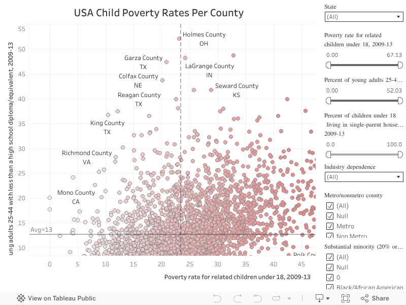
In this lab, we created a four quadrant scatter plot based on child poverty rates in the US per state and county provided to us via Blackboard. In our chart, we included a vertical average line for the poverty rate of children under 18 and a horizontal average line for the percent of young adults age 25-44 with less than high school diploma. We used a scatter plot to plot the data points and symoblized them by color with darker red/orange being a higher poverty rate and white/gray being a lower poverty rate. - Ryan Facks zID 2027325
The relationship between child poverty rate, adult education and percent of single parent households.
There appears to be a direct coorelation between single parent households and lower adult education. Consequently, the lower education appears to indicate a higher rate of poverty amongst communities. If we use the slider labeled "Percent of children under 18 living in single-parent households" and slide it back and forth, we can see that values near the high end of the range are counties with substantially higher pvoerty rates. Inversely so, counties with lower poverty rates are on the lower end of the percent of children living in single-parent households. Without more data we can only assume, but I believe there is a strong implication that a single parent simply cannot pursue higher education or career growth when they are taking care of a child on their own. The data clearly shows that more rural states (such as Teas or Montana) are pushed into the upper right quadrant where GED's/High school diplomas are all that person has achieved and poverty rates are well above average, sometimes nearing over 60%. These more rural states may have less access to child care, child planning services, and social resources to help raise a child. Additionally, if we use the "Substantial Minority" radio buttons, we can see another data trend that communities with a higher minority percentage are more likely to have only achieved a high school diploma and have a higher poverty rate for children. - Ryan Facks zID 2027325
The importance of filtering data
When creating this chart, we needed to uitlize data filters to explore the data more. Without considering other factors such as race, metro versus non-metro areas, etc., we are limited to the data at face value. The filters allow us to drill down into more socioeconomic factors and reveal trends that may not be easily plotted on their own. By allowing our users to filter our data, a user could discover insights that maybe even the creator of the chart was not aware of. The "on the fly" nature of geovisualization via Tableau demonstrates the benefits of computer aided data visualization because we are not stuck to static chart. Static charts can be decieving and potentially misleading if a person is not able to explore the data themselves or even just isolate a particular phenomenon that they are intersted in. - Ryan Facks zID 2027325


Comments
Post a Comment