Lab 3 - Tasks 1 - 2
NHL Career Points Leaders (Lab 3 Task 1)
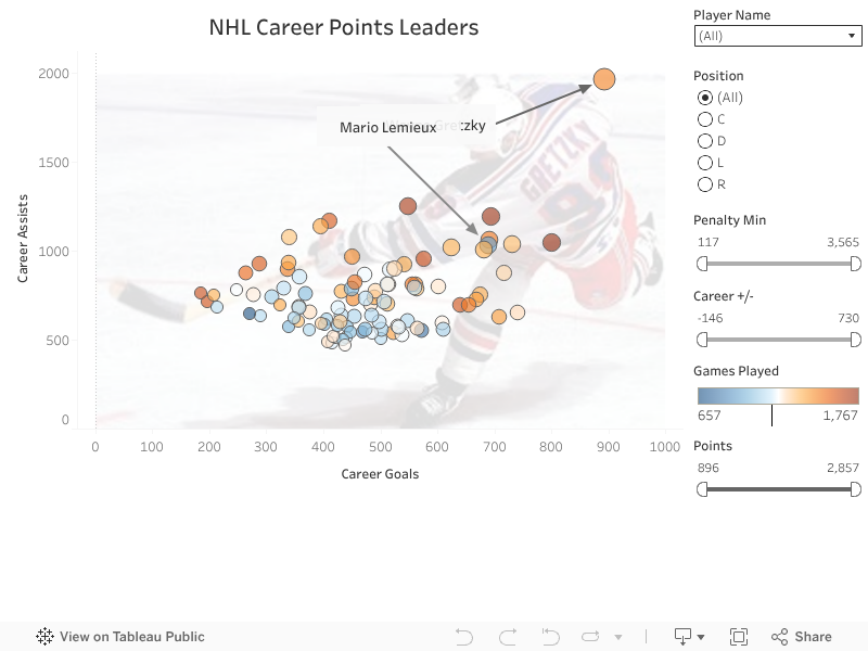
This is the first scatter plot created for task 1 in our 3rd lab for EAE 452. The scatterplot describes the relationship between Career Goals and Career Assists in the NHL top 100. In this excersise, we used filters to allow the user to explore the data at their own discretion. You can manipulate the data with the sliders and radio buttons on the right. - Ryan Facks zID 2027325
NHL Goals Per Shot Quadrant Chart (Lab 3 Task 2)
This is the four quadrant scatter plot for lab 3 task 2. In this scatterplot, we have average shots line going vertical and average goals line going horizontal to split the data into four quadrants. This helps us categorize players into high and low accuracy, and high and low production. We also label the players names to make them more easily identifiable. - Ryan Facks zID 2027325

Which chart is more effective?
I think it depends heavily on who is viewing the data. If you are a knowledgable about hockey and a big fan, you might like to explore the data more and therefore the first plot with the configurable filters may be more interesting you. Inversely so, if you are like me, and not a big sports fan, I find the second chart to be more easily digestible. On the second chart I can quickly ascertain a players name and what category they fall into. I also believe the second chart "does a lot of the organization for you" in the sense that, on the first chart, you must configure some of the filters yourself to truly achieve some data insights. - Ryan Facks zID 2027325


Comments
Post a Comment