Final Project - Chicago Divvy Bike Usage in 2019
Chicago Divvy Bike Usage Dashboard (EAE 452 Final Project)
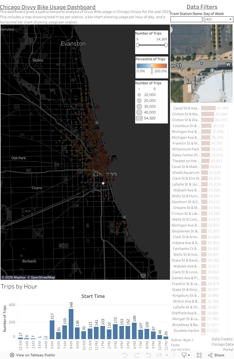
This dashboard is used for my final project for EAE 452. This dashboard seeks to provide a spatial temporal analysis of Divvy Bike usage across Chicago in 2019. I restricted my analysis to a single full year for two main reasons. One, the Chicago data portal only has data for 2013 - 2019 and two, there are simply too many records for Tableau to handle on my computer if I include all available data (It was over 21 million records!). The dashboard is constructed with four main components; The map view of stations and their usage numbers, the trips by hour bar chart, and the total trips bar chart, and an embeded Google maps area. All four elements are connected together due to a shared data source, dashboard actions, and there are data filters to further drill down on the data. For example, you can select a particular day of the week and the dashboard will dynamically change to show the usgae per hour, the usage on the map, and the totality of usage per station in the bar chart. All data credits go to the Chicago data portal. Click around and explore the data! Ryan Facks - zID 2027325
Introduction
As a commuter in Chicago who lives without a car, I rely heavily on public transit options and therefore thought to focus my EAE 452 final project on Chicago’s Divvy network. Divvy bikes are a bikeshare system available across Chicago where there are stations for bikes and scooters that commuters can use to traverse the city. As a commuter, I was curious about the usage patterns of Divvy bikes across the Chicago area. I sought to investigate Divvy bike usage through a temporal lens to investigate hot spots of Divvy usage, peak time of day usage, and which stations overall saw the most usage. There were other dashboards online that displayed Divvy usage data, specifically one via the Chicago data portal, but the dashboard lacked the ability to explore the data comprehensively so I wanted to make my own using geovisualization techniques I learned throughout the semester (Chicago Data Portal). To facilitate this data exploration, I leveraged Tableau and public Divvy data available via the Chicago data portal. Using techniques I learned this semester, I produced a Tableau dashboard comprised of three sheets that is embedded on my Blogger.com webpage.
Methodology & Visualization Techniques
As all geographic information systems projects begin, I had to start with defining the study area and data acquisition. For my project, I focused on Chicago, Illinois specifically within Cook County. For our first major chunk of data, I needed to find the actual Divvy stations locations themselves. For this I used the Chicago Data Portal and found the Divvy Bike Stations data set (Chicago Data Portal). I used the online filtering to filter to only stations that were flagged as “in service” as to not map data to stations that are not currently operational which left me with a CSV file with 1,151 records all representing active Divvy stations. The Divvy Trips data set was also on the Chicago Data Portal but only had data for the years 2013 – 2019. After noticing that the unfiltered dataset has over 20 million records, I decided to narrow my study down to a single full year as my computer could not handle that much data. I arbitrarily chose the year 2019 because it was the most recent full year of data and the dataset had 3,817,988 records all representing individual Divvy trips (City of Chicago). Before I began to make our sheets, I performed a table join between the Divvy trips and the Divvy stations where many Divvy trips could map to one Divvy Stations. It was at this time that I decided to map the “from” location as opposed to the “to” location because I intended to study Divvy trip departures as a measure of an areas usage rates. After the join, Tableau showed me that I had 3,239,389 records that each represented a valid Divvy trip tied to an active Divvy station. As a final note on the source data for this project, three million records is almost too many for Tableau to handle and the resulting dashboard struggles at times to keep up with the data processing.
Next came assembling the three sheets for my dashboard which are the spatial map of Chicago with Divvy stations plotted, the bar chart based on time of day, and the horizontal bar chart representing total trips per station ranked. To create the Divvy stations map, I created a new sheet in my Tableau project and began by adding the fields “from station latitude” and “from station longitude” fields to the map. I then added the station name to the detail marks card, the count of trips to the size card, and the count of trips to the color card. I utilized a blue to orange diverging palette and symbolized it on the percentile of trips per station. Using the percentile as opposed to the total number of trips allowed my diverging color scheme to have blues represent less than fifty percent percentile, whites represent the middle, and oranges represent above the fifty percentile. To understand when commuters used the Divvy bikes throughout the day, I created a time series chart based on the hour of the day. To create this sheet I had to use date functions to extract just the hour of the day to be used as my x-axis. After putting the total count of trips on the y-axis, the key component of this second sheet was putting the extracted weekday as a filter so I could then filter my time series by the day of the week to compare, for example, if weekends are more busy or less busy than weekdays. To help identify the most heavily trafficked commuter hubs, I created a third sheet which is a horizontal bar chart that ranks each station’s name by the total trips originated from that station. All sheets utilized the same blue-white-orange color scheme to help maintain the same visual hierarchy when it came time to create the dashboard.
When creating the dashboard, I had three sheets, several filters, a Google maps integration, and dashboard actions to help tie all the data together. The first step in creating the dashboard was to get all of the sheets and items actually on the canvas. Before beginning, I modified my canvas to be portrait style as I know Chicago is more vertical than horizontal and the map should be the main feature of this dashboard. I started first with the map of Divvy bike stations and made it approximately 70% of the center left side of my canvas, being the primary feature of this dashboard, I wanted it front and center. Then, I put the time series chart near the bottom in a relatively thin fashion as I felt the time series would make more sense taking up horizontal space. Then, I put the total station ranking chart on the right side of the dashboard and made it thin and removed x-axis information and instead placed the count labels directly on the bars. Additionally, I decided to add a Google Maps integration that would dynamically change to the station selected so users can get an idea of what the surrounding area looks like at their selected station. I placed the Google Maps integration in a box in the upper right next to my data filters as I figured it was closest to the horizontal bar chart and the map where users would more than likely be clicking back and forth between stations frequently and the Google map would still be in view. Several filters were put in the top right that apply to all sheets in the dashboard and allow the user to either search for a station by typing in a name, or use the day of the week filter to gain insights into how the data changes from day to day. Dashboard actions were also employed to help each of the three sheets and the Google maps integration all interact with each other dynamically. Highlight actions were used between the map and top stations horizontal bar chart so that when a user selects one on either sheet, it grays out all other data and highlights the relevant data across all sheets except for the time series chart which did not make sense to highlight. Additionally, I created a temporal filter action that instructs the map and top stations chart to filter the time series sheet to the trips originating per hour from that location which gives this dashboard a true spatial and temporal analysis. Finally, the dashboard was completed by adding a title, description, author information and of course data credits to the Chicago Data Portal (Figure 5).
Results
When looking at my data, there are three areas I can focus on being the patterns I revealed, the overall effectiveness of my dashboard, and potential improvements that could be made. When it comes to patterns, the temporal aspect of my dashboard allows me to confirm assumptions that you may already have such as the fact that on business days there are huge spikes around the morning and afternoon as people come to work and leave for home in the afternoon as well as the high percentile stations being near the central loop of Chicago (Figure 1 and 2). However, on the weekends the usage on the timeseries chart is more of a left skewed distribution with a peak around three in the afternoon and many of the high percentile stations being even spread throughout the city and along the shore line. I can assume that these patterns are because commuters use the Divvy bikes to get to and from work locations in the city during the week days and that riders are primarily downtown. Conversely, I can see that more leisurely and evenly distributed usage is on the weekends where riders are more likely to not be using the bikes to get to work. The effectiveness of the dashboard can be primarily attributed to the use of the blue-white-orange diverging color scheme based on the percentile of trips. Very clearly I can identify which stations are receiving above or below average usage compared to all other stations mapped. The dashboard actions allow us to focus in on particular stations and see how the data reflects for that particular station. Personally, I feel like the time series chart really drives the data exploration in this dashboard as it gives the temporal aspect to this project that I wanted to achieve. If I were to iterate upon this project, I would begin by trying to implement a live API integration that continuously updated the Divvy bike information. The Chicago Data Portal claims to have a data API that one can invoke but it was outside the scope of this project and I had trouble enough getting Tableau to render the millions of records even just for one year. Additionally, I would like to figure out how other dashboards are able to render large amounts of data as I learned very quickly during this project that either I am ingesting too much data into Tableau or I am ignorant of some computational optimization to allow for large data sets. Either way, this project could be greatly improved if not constrained to a single year and the obvious performance issues.
Discussion
Overall, the objective of this project was to transform over three million static and disconnected Divvy bike records into an interactive dashboard that allows the user to explore the temporal aspect of Divvy bike usage in Chicago. Tableau allowed us to use date functions, data filtering, and cross-sheet interactions to help bring about data insights previously unknown. The visualizations help illustrate city-wide commuter behaviors capturing the downtown hustle and bustle of weekday first shift workers as well as the leisurely usage along the shoreline on the weekends. This dashboard did illustrate computational constraints due to the dataset being millions of records large, and a live API integration was simply outside the scope of this project. The resulting dashboard serves as a proof-of-concept that geovisualization can be used to understand a city’s commuting habits and show the value of interacting with dynamic spatial data.
Figure 1 - Chicago Divvy Stations on Tuesdays in 2019

Figure 2 - Chicago Divvy Stations Usage Per Hour on Tuesdays in 2019 - Peak Usage times Marked in Red

Figure 3 - Chicago Divvy Station on Sundays in 2019

Figure 4 - Chicago Divvy Station Usage Per Hour on Sundays in 2019

Figure 5 - Screen Cap of Final Dashboard Layout

Works Cited
Chicago Data Portal. "Divvy Bicycle Stations." 23 March 2026. Chicago Data Portal. 23 March 2026.
—. "Divvy Trips Dashboard." Chicago Data Portal. Chicago: Chicago Data Portal, 23 March 2026. Dashboard.
City of Chicago. "Divvy Trips." 20 March 2026. Chicago Data Portal. 23 March 2026.


There is a known issue with the loading times of this map. This is due to the high record count of the data source.
ReplyDelete