Hurricane Season in 2012 - Lab 9 - Part 2
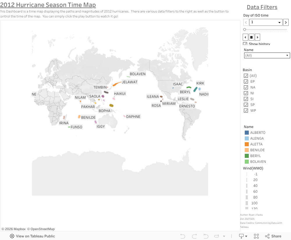
In the second part of lab 9, we created a temporally animated map displaying the hurricane season of 2012. To better organize and visualize our results, we made a dashboard in Tableau. In the dashboard, the map is the main focus of the dashboard, with a title and description at the top. I put all of the data filters on the right side of the dashboard as well as data credits and author information at the bottom right. In the data filters, the most important one is the ISO time filter which allows you to scroll with the time chart or simply hit the play buttom to have the time series go. Additonally, you can filter by Basin or hurricane name down below as well as see the legend for the proportional size to wind metrics. There is an embedded video down below to show the map actually animated because Tableau public does not allow it natively. Ryan Facks - zID 2027325
Embedded video
Question for Lab 9 - Which fields in the attribute tables are critical to implement the animations in both the population change and hurricane paths? How are the fields organized?
For the population change exercise, the critical fields are the start date and the end date as these both drive the temporal aspect of our animation. If we did not have the start and end time, we would not be able to create key frames that span the decades. Additionally, the actual shape and location of our shapefile is critical to actually map the counties. The population field obviously drives our symbology for both our 2D map as well as the extursions for the 3D moap. For the hurricane paths exercise, the cirtical fields are the ISO date time, the latitude and longitude, and the hurricane name fields. The name helps us label our hurricanes that we plot with the latitude and longitude fields. The ISO date time allows us to create a temporal filter for our map and have it be animated based on time. For both of the datasets, their tables have records that refer to individual items where the population shapefile has each record representing a county and the hurricane spreadsheet having each record indicate an individual hurricane. Ryan Facks - zID 2027325


Comments
Post a Comment